

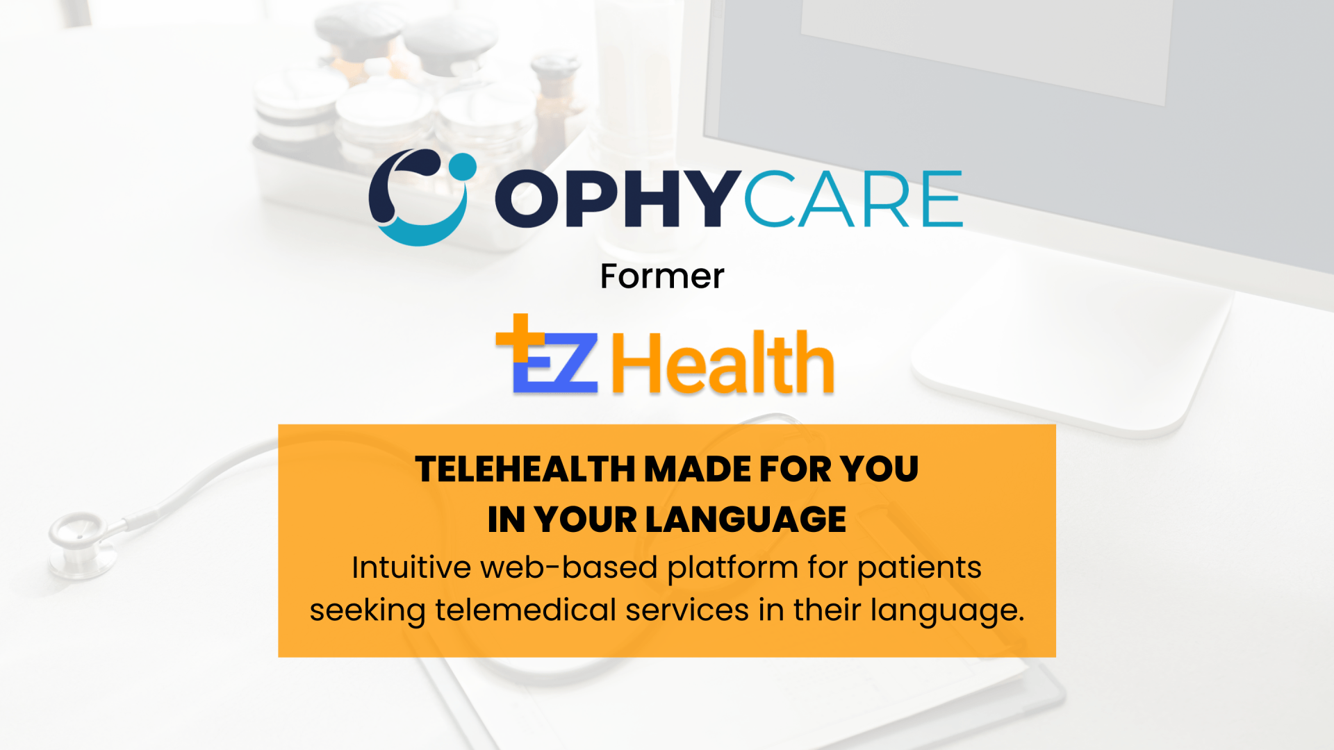
Telemedicine has revolutionized the medical industry, and EZ-Health is a pioneer in connecting patients with doctors and specialists in their native language. The goal of this case study was to understand the user experience problem, Ez-Health website has, and finally redesign the entire website solving the usability issues, providing a user friendly and accessible experience.
TEAM
2 UX DESIGNERS
1 DEVELOPER
DURATION
2 WEEKS
TOOLS
FIGMA
AXURE
MAZE
CANVA
MY ROLE
RESEARCH
UI DESIGN
PROTOTYPE
USABILITY TEST
New Paragraph


DISCOVER
THE PRIMARY USER
PROBLEM STATEMENT
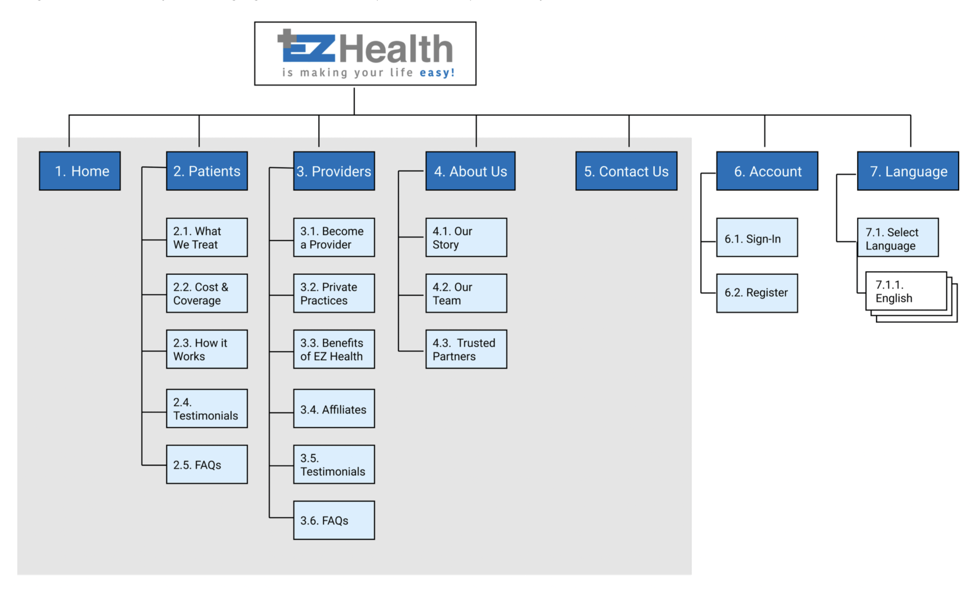
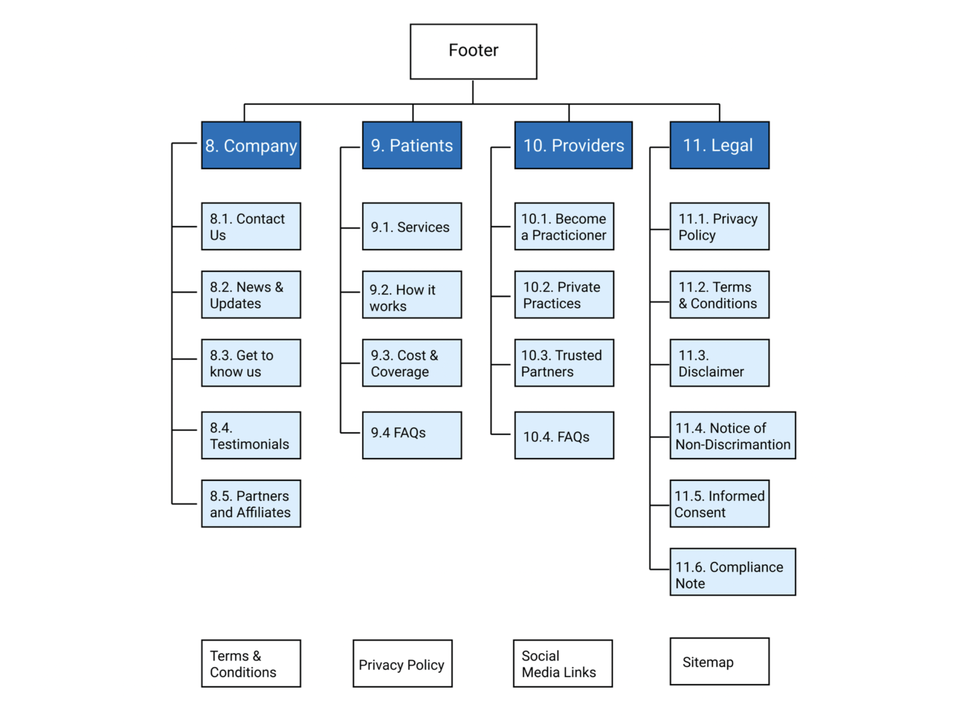
INFORMATION ARCHITECTURE
Hierarchy & Information Architecture
FEATURES OFFERED BY COMPETITORS
ABOUT
POJECT GOALS
INTERVIEWS
CURRENT USABILITY CHECK
CURRENT WEBSITE
USER JOURNEY
COMPETITION
Interview Plan
PERSONAS
Founded in 2020 through a start up lab at Colombia University. Ez-Health bridges the gap between US healthcare and non english speaking patients. Through the use of video conference technology, connecting patients with medical providers of the same language and cultural background.
Leverage extensive user-centric research to obtain a clear understanding of their primary users' needs and frustrations while inspiring trust, streamlining the user experience, and winning new customers loyal to the Ophy Care brand.
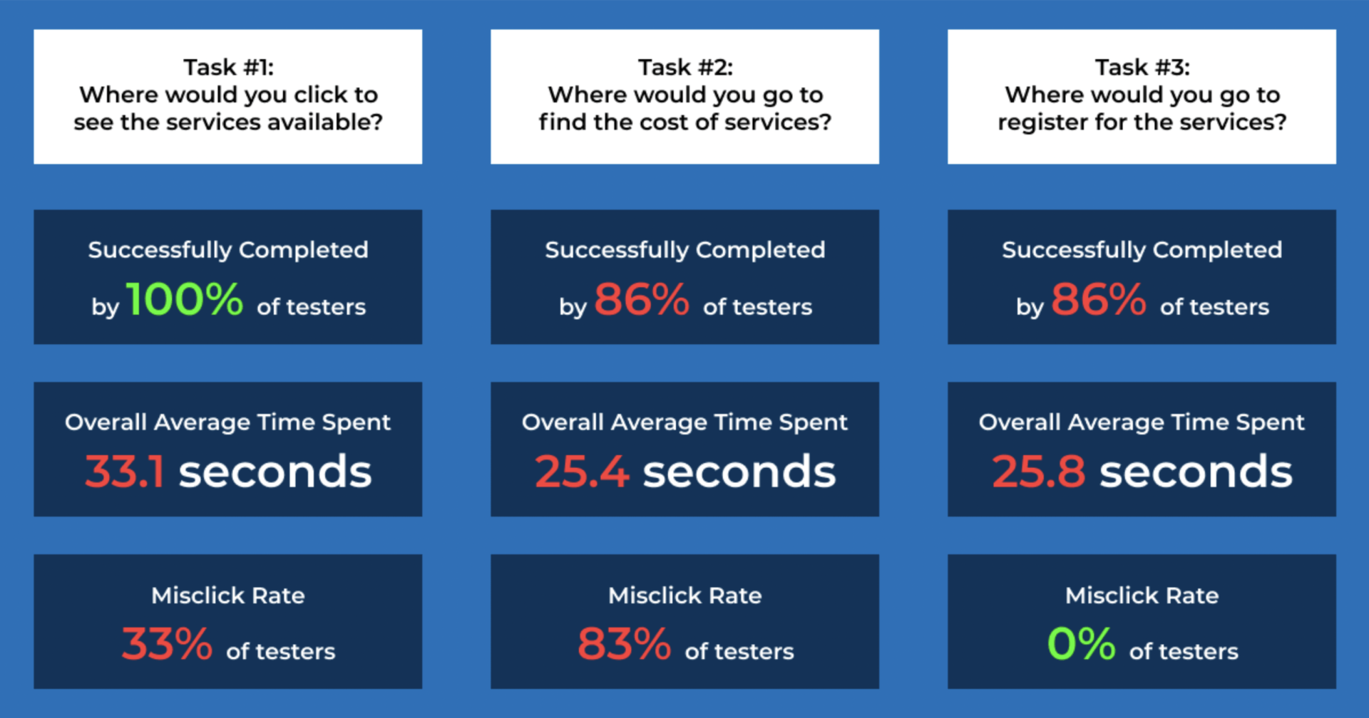
We defined the following metrics to ensure that test was successful:
- Task completion: By 87% or more of the participants.
- Average time spent on task: Between 15-20 seconds.
- Mis-click rate: Below 33%.
What insight did the first click test reveal?
- Users will abandon the website if they spend more than 25 seconds trying to accomplish a task. One user abandoned the website after 60 seconds because they believed that there was an error in the test. The test worked without issue, but the user simply could not locate the information.
- It’s important to provide multiple options to achieve the same goal. Our users clicked on the navigational bar and section titles to complete their task.
- Include local navigation under the global navigation bar. The current global navigation bar forces users to scroll through all healthcare service information to find the desired cost information, resulting in an 83% misclick rate in Task #2.
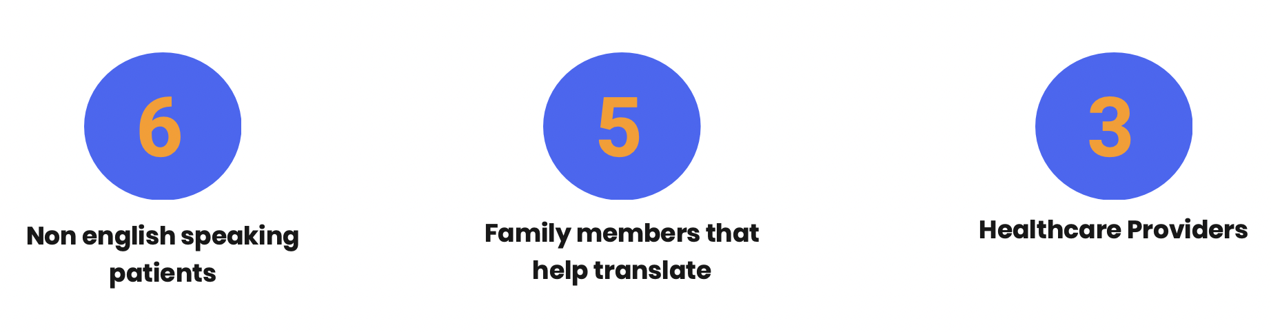
We initiated our research by meeting with EZ-Health's founder, CEO and their in-house UX Designer to fully comprehend their vision and goals for the future of EZ-Health, as well as their challenges and setbacks. Followed by a total of 14 interviews we conducted with non English speaking patients and healthcare providers.
We conducted heuristic analysis to better understand the website’s structure and reveal areas for improvement based on user pain points identified during the first click test.
We asked the 7 non-native English speakers to take a first click test to gain insight into the clarity of the information presented and determine the information architecture.
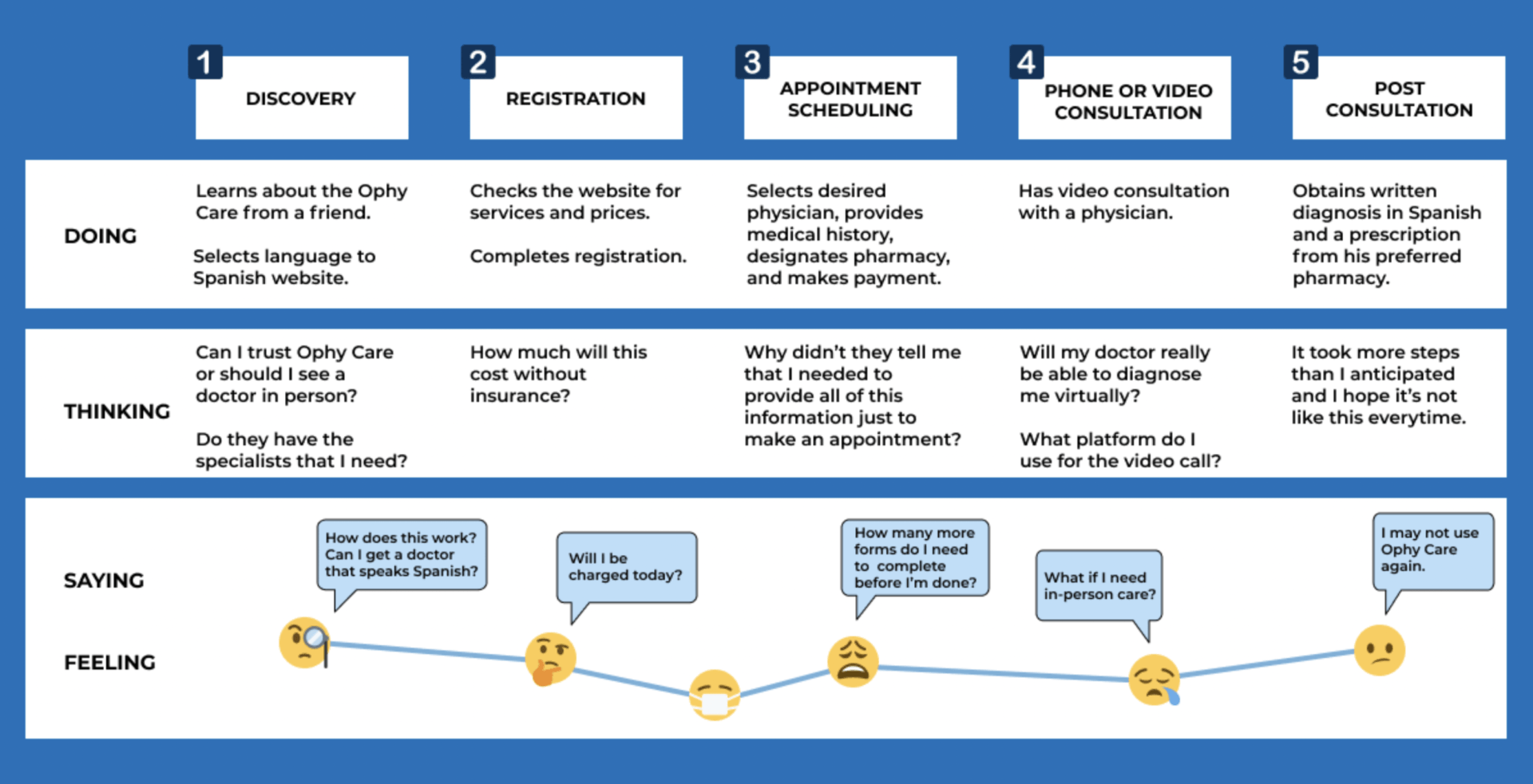
We developed a user journey map to depict the users’ emotions and thoughts while navigating the website.
They began their experience weary of Ophy Care and was frustrated with the multiple, unexpected steps. While happy to experience medical care in Spanish, they are unsure if they will use Ophy Care again. Not knowing if they will need to reenter their information when seeing a new doctor, makes them feel overwhelmed.
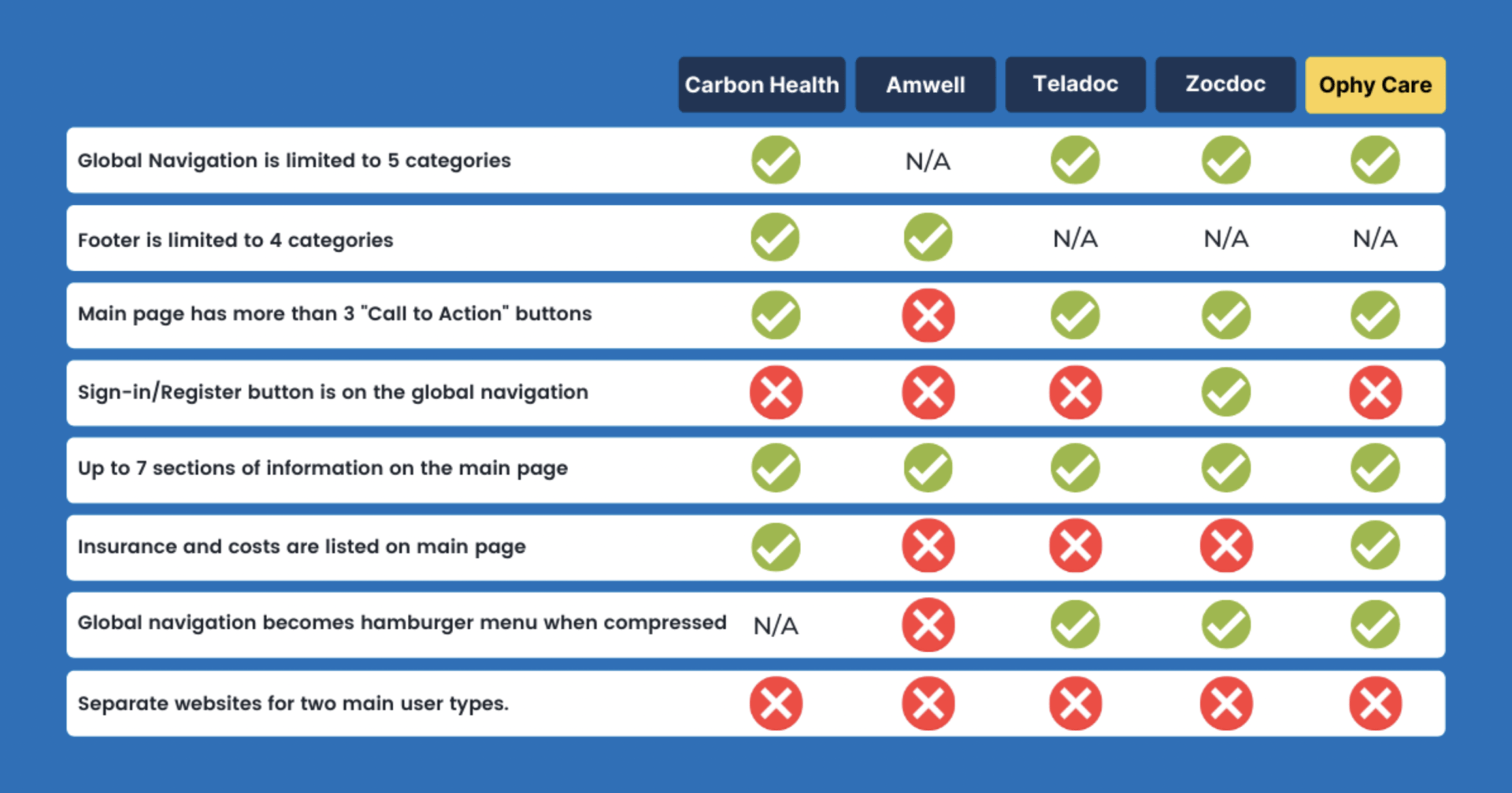
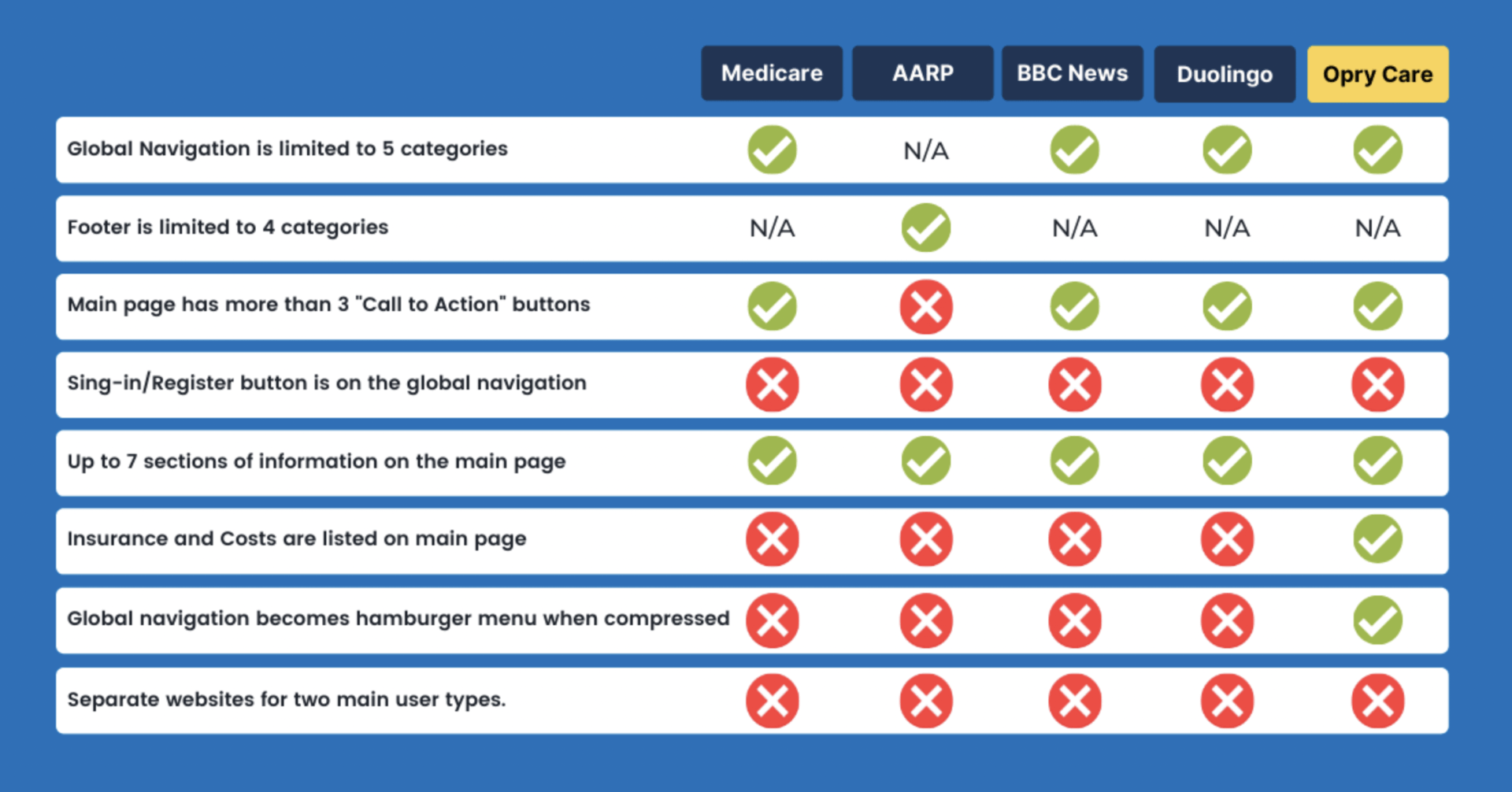
Our comparative analysis focused on websites catering to senior citizens, as Ophy Care advised that their primary users are over 65. We paid special attention to how rivals presented and structured information.
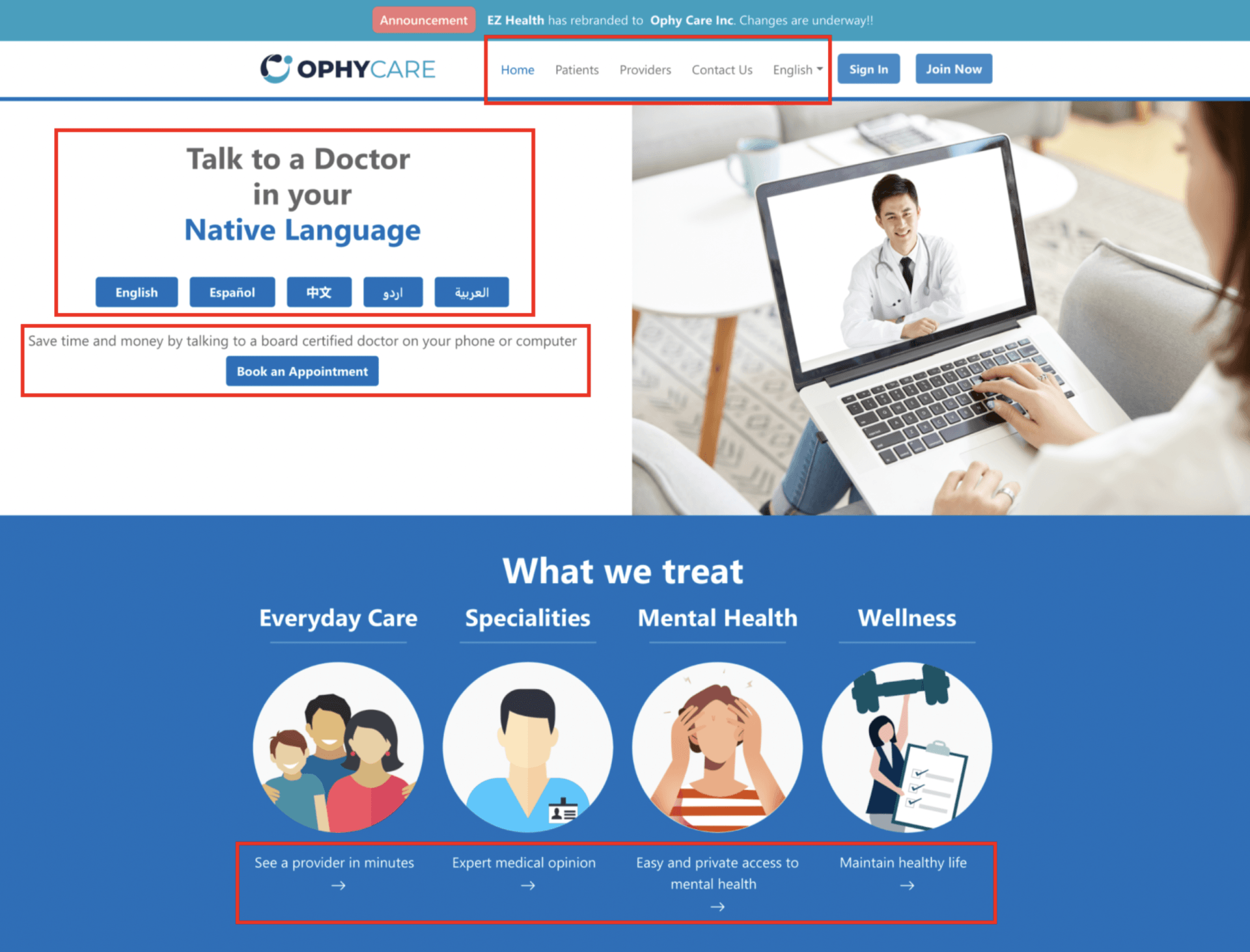
Home Page
- Navigation Bar: The global navigation bar lacks a local navigation feature. In the absence of clear direction, users are forced to navigate through various pages to find the desired information.
- Language Selection: The call to action (CTA) has no clear instructions for the user.
- Unclear Messaging: Buttons and CTAs do not match the message presented and there is conflicting information.
- Buttons: Ophy Care uses buttons that are inconsistent with industry standards that may introduce confusion and drive down successful click rates.
- Format: Titles are inconsistent, images lack contrast, and the font weight and color creates legibility issues.
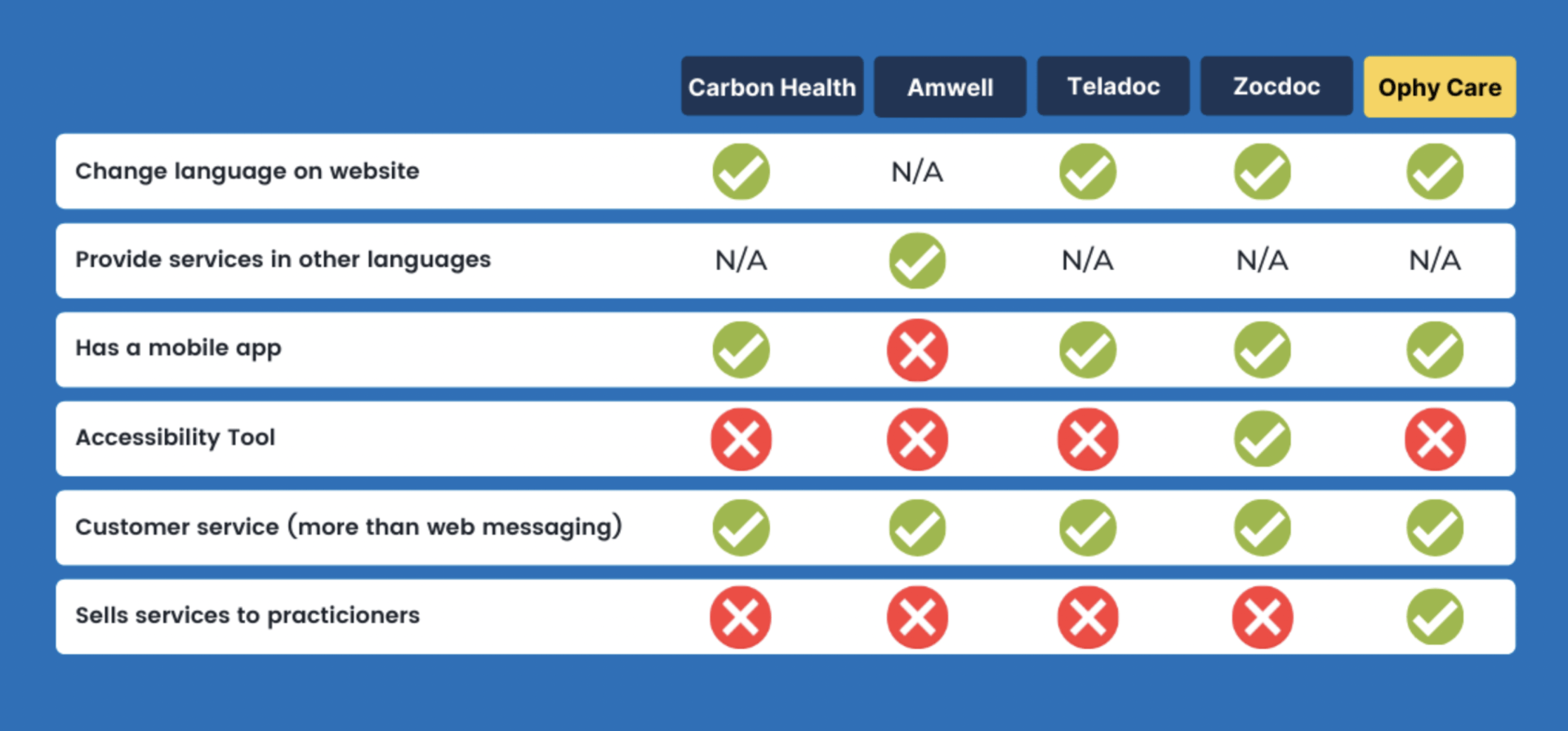
The competitive analysis assessed how Ophy Care’s telemedicine market rivals outpaced their competitors and fell short. We examined the information architecture, visual design, and navigational features present on Carbon Health, Amwell, Teladoc, and Zocdoc’s websites.
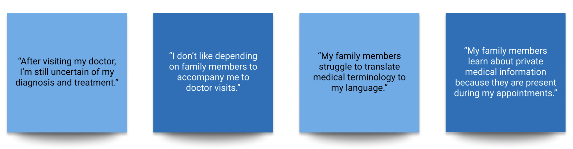
we uncovered 4 overarching insights from the patients interviews.
Non-native English speakers reported frustration and diminished understanding when receiving medical advice in English. Family members serve as translators in healthcare conversations, resulting in patient privacy concerns, administrative burden on family members, and potential mistranslation of medical terminology.
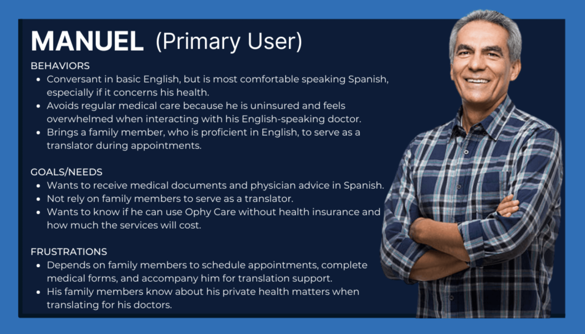
We referred to the primary persona throughout the redesign process to anchor design decisions in their needs while constantly addressing their frustrations and goals. Above all, this enabled us to champion user advocacy when meeting with Ophy Care stakeholders.
Manuel needs a telemedicine website that is linguistically and demographically inclusive, so that he can independently consult with his medical providers without the need for family members serving as medical translators and advocates.
To
increase users’
product discovery
success rates and
streamline
the
registration process, we identified the optimal layout for each category by combining the interview insights, the heuristic analysis, and insight gleaned from the competitive and comparative analysis.
By making Ophy Care immediately
translatable and by
simplifying the discovery and registration processes, the redesign will
allow non-english speaking users to
access the website and its services independently, without the need for secondary support. Ophy Care can only achieve this by
restructuring the information hierarchy and
optimizing the account registration and appointment scheduling processes.
Following the information dense
interviews, we developed a
persona, representing the non-english speaking
patient.
SOLUTION
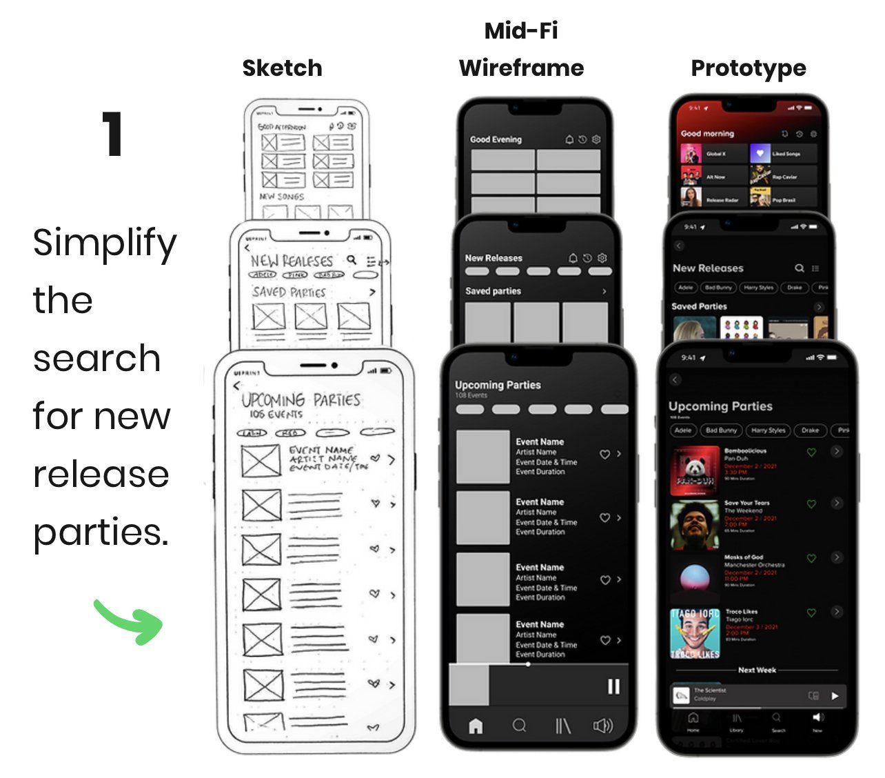
1
Simplify the search for new release parties.
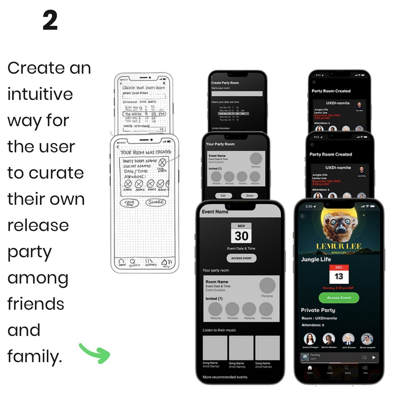
2
Create an intuitive way for the user to curate their own release party among friends and family.
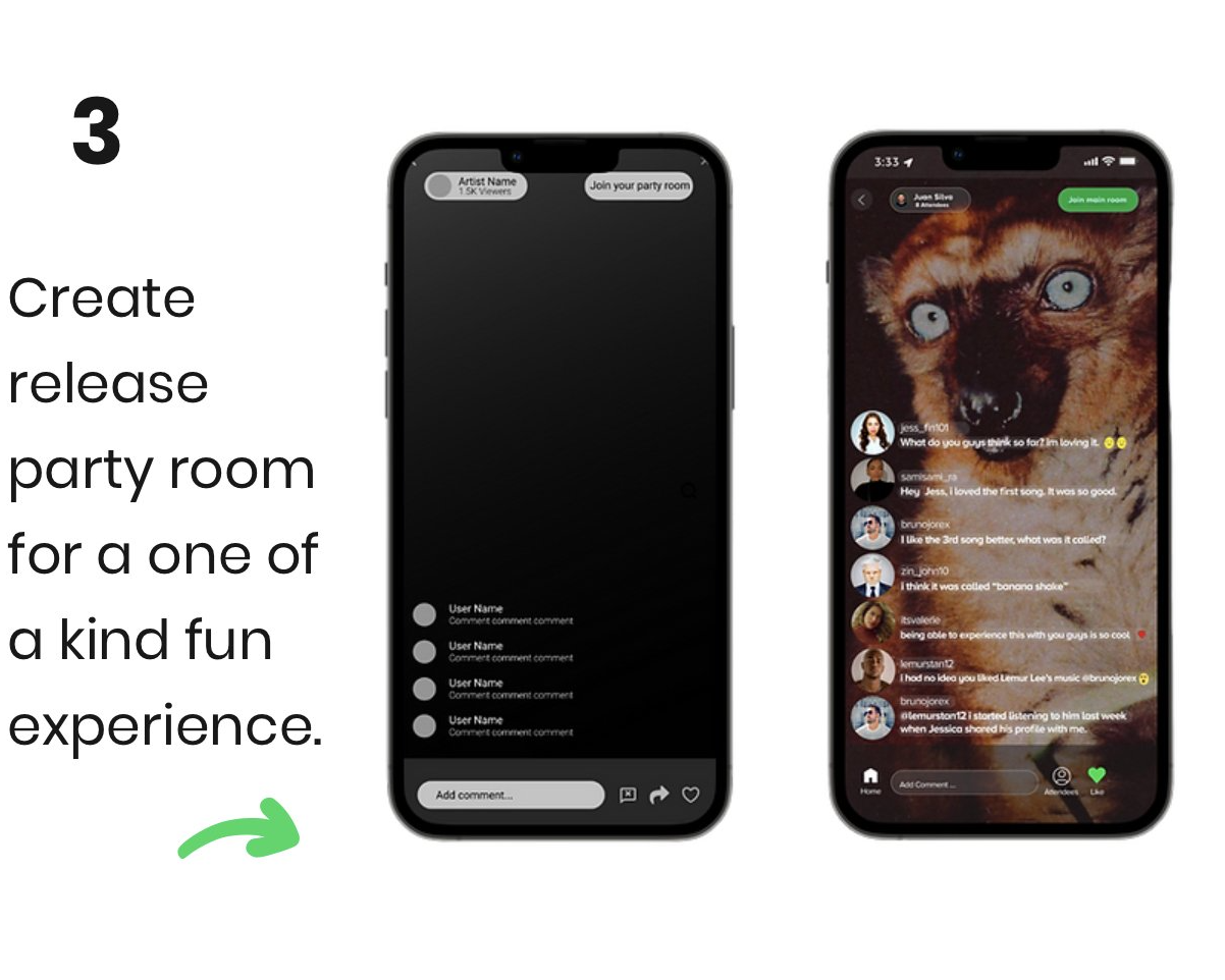
3
Create release party room for a one of a kind experience.
USABILITY TESTING
USER FEEDBACK
DISCOVER
DISCOVER
DEFINE
DEFINE
DESIGN
DELIVER
USER TESTING

"Very intuitive, but pay attention with some font visibility issues. " User 2

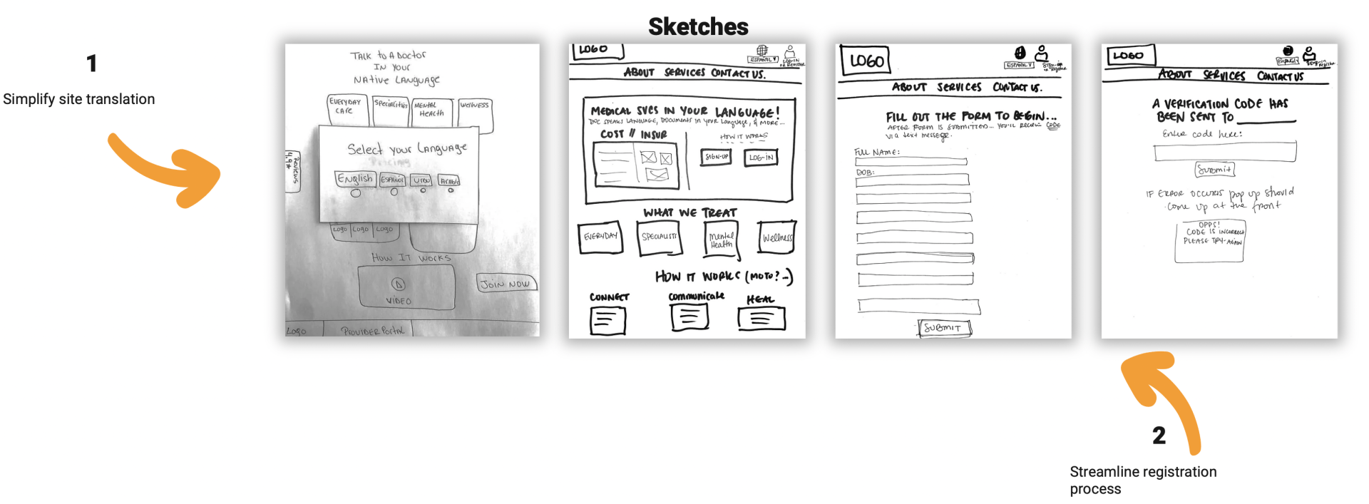
1
Simplify immediate translation of site
2
Streamline registration process, and profile creation.
3
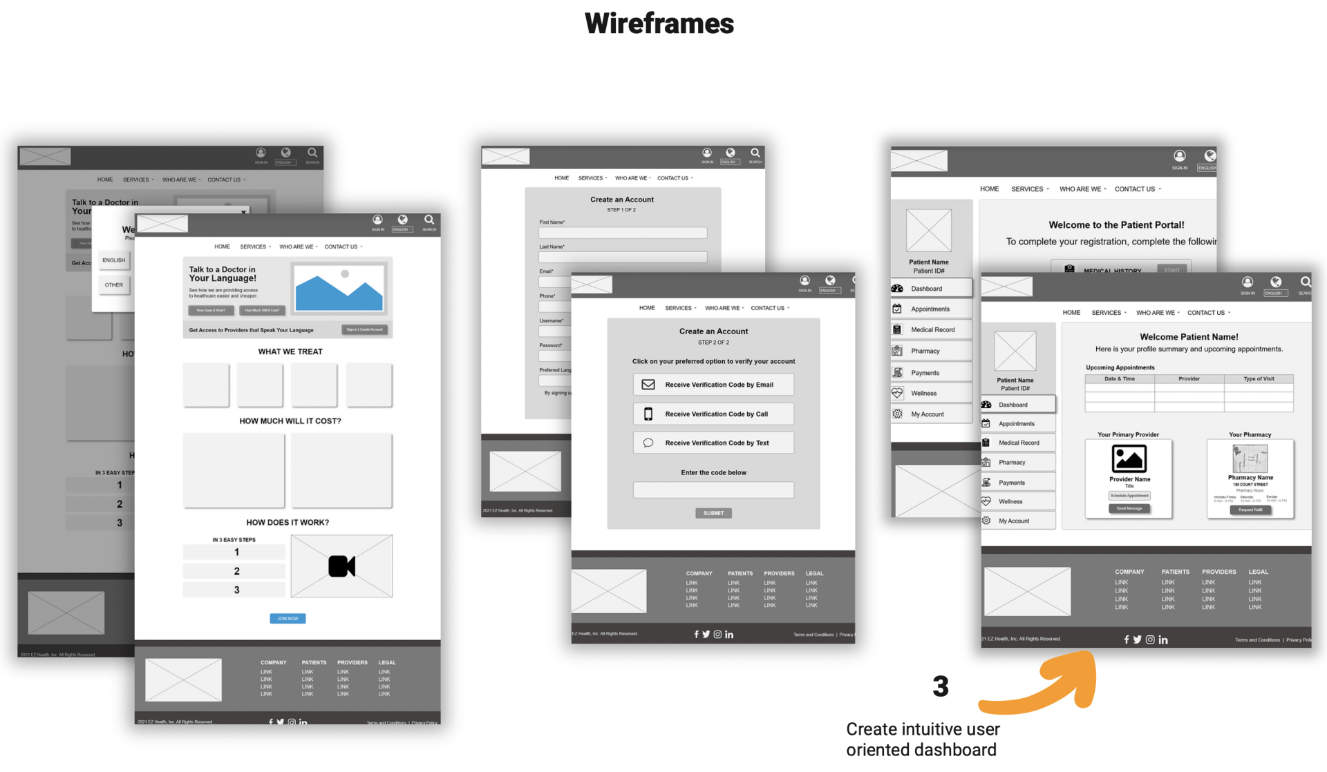
Create intuitive user oriented account dashboard.
Design Process
To ensure that our design goals were being met. We held a design studio session to explore the team's ideas and acquire stakeholder buy-in throughout the redesign process. We deliberately included Ophy Care’s developer to ensure that the design goals were feasible and aligned with the projected timeline.
Our proposed contributions to the redesign include:
- A modal lightbox for visitors to select their preferred language for navigation.
- Enhanced information hierarchy reflecting user input.
- A simplified account registration form.
- A list of remaining forms to complete on the patient portal dashboard.
We verified the redesigned website’s usability with the first click test from our initial research and compared metrics to quantitatively measure results.
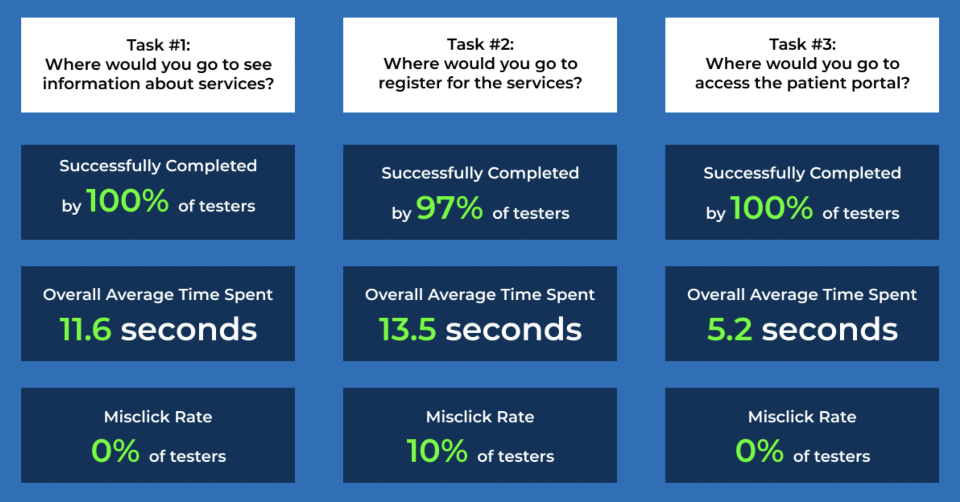
Across all tasks, users experienced a 54 second reduction in overall time spent with completion rates increasing by 25% and mis-click rates falling to almost 0%.